UI / UX Design
Nestly - Energy Saver
At-A-Glance
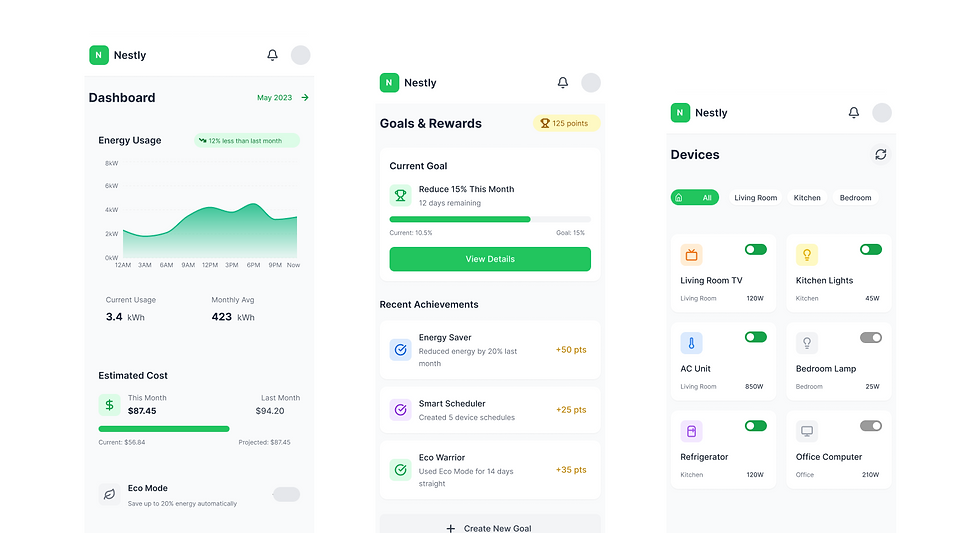
Nestly is a mobile app I designed and built to help Australians take control of their electricity usage and lower their bills. The app allows users to monitor real-time energy costs, remotely switch appliances on or off, track upcoming bills and discover energy-saving opportunities. The core aim was to make energy management simple, transparent and cost-effective while offering a modern, intuitive interface.
Solo Project
My Role
UX research,
UI design, product design, prototyping
Timeline
Sept 2024 - Jan 2025

Tools
Figma, Adobe XD
Adobe Illustrator
Starting thoughts....
Energy Use: Confusing, Costly, and Out of Sight
Before Nestly, most Australians had limited visibility into how their electricity was being used day-to-day. High bills came as a surprise, and users had little control over reducing costs. Existing solutions were either too technical or lacked user-friendly features, leaving a gap for a product that combined energy savings with convenience.
The Solution
Power back in
your pockets.
Nestly makes saving on electricity simple and rewarding. Users can track real time costs, predict upcoming bills and control appliances remotely while earning rewards for energy smart choices. By turning savings into a game like experience, the app motivates Australians to cut costs, build better habits and feel good about using less power.
Energy Use: Confusing, Costly, and Out of Sight
Energy Use: Confusing, Costly, and Out of Sight
Before Nestly, most Australians had limited visibility into how their electricity was being used day-to-day. High bills came as a surprise, and users had little control over reducing costs. Existing solutions were either too technical or lacked user-friendly features, leaving a gap for a product that combined energy savings with convenience.
Energy Use: Confusing, Costly, and Out of Sight

01. Discover
Before building Nestly, the focus was on deeply understanding the problem space and setting a clear direction for the product. Rising electricity costs were putting pressure on Australian households, yet there was no simple or user-friendly way to track usage, predict bills or actively save money. Through research, it became clear that many families were blindsided by unpredictable bills, often unsure of what was driving the sudden increase. At the same time, everyday habits like leaving lights, appliances and devices running—were quietly wasting power and money without people realising it.
Beyond the financial stress, there was also a lack of motivation. Even households that wanted to cut back on energy use struggled to stay engaged without a sense of reward or progress. Meanwhile, existing energy apps in the market felt overly technical and clunky, leaving room for a solution that focused on clarity and ease. These insights shaped the foundation for Nestly: an app designed to make saving energy simple, rewarding and seamlessly integrated into everyday life.
1. Unpredictable Costs
Families were often surprised by rising bills, with little visibility into what caused the spikes.
2. Everyday Habits
Lights and appliances were left running unnoticed, quietly wasting energy and money.
3. Need for Motivation
Even when people wanted to save, the lack of feedback or rewards made it hard to stay engaged.
4. Opportunity in Simplicity
Existing apps felt clunky and overly technical, creating space for a clearer, more intuitive solution.
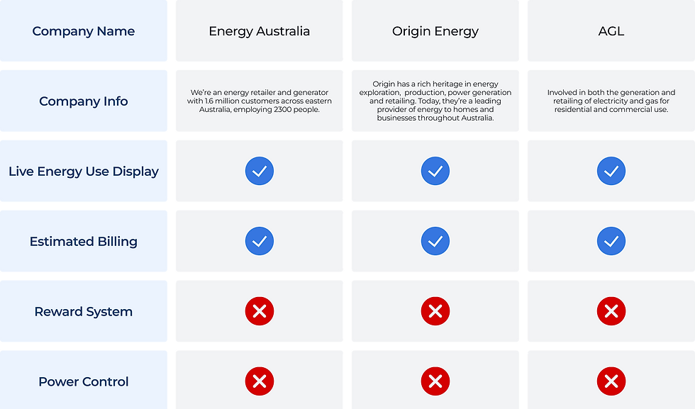
Competitor Analysis
Quantitative Analysis
Australians are increasingly concerned about rising energy costs, but most households struggle to stay proactive about usage until it’s too late. Nestly offers customers an easier way to track energy, automate savings and get rewarded for reducing consumption.
Screeners
-
Must live in Australia and pay a regular electricity bill (monthly or quarterly).
-
Responsible (solely or jointly) for household energy management.
-
Owns at least one smart device (e.g., smartphone, smart meter, or connected appliance).
-
Open to trying new apps to manage or reduce household bills.
72%
65%
81%
76%
only notice their electricity bill after it arrives, not during the billing cycle.
say they feel “surprised” or “caught off guard” by higher-than-expected charges.
would use an app more often if it offered rewards or discounts for saving energy.
prefer cashback or bill credit over other rewards like vouchers or points.
68%
39%
62%
want a real-time tracker of daily or weekly usage to avoid bill shock.
want an auto-shutoff feature for appliances left on accidentally (e.g., heater, lights).
say saving energy for the environment is important — but they act mainly when it also saves them money.
Pain Points
1. Lack of Real-Time Insights
Most energy apps only show usage after the bill arrives or in delayed reports, leaving users feeling reactive rather than in control.
2. Poor Engagement & Motivation
Existing apps are functional but dull, they don’t gamify savings or reward users, so people lose interest quickly and stop checking.
3. Complicated Interfaces
Many apps are designed for utility companies, not users, hard-to-navigate menus and lack simple controls like turning appliances off from one place.

02. Empathise
Who is actually using this app?

I have learnt that users like Lucas do not just need raw data about their energy usage but clear and practical insights that help them feel in control. While Lucas is motivated to save energy he often forgets to turn appliances off and only realises the impact when the bill arrives. This shows that current solutions lack immediacy and meaningful rewards which makes saving energy feel unrewarding or too abstract. For Nestly this means the app should focus on making energy use visible in real time and linking savings directly to motivating incentives.
I have also learnt that emotional drivers are just as important as functional needs. Lucas feels guilty about wasting electricity and frustrated when bills are higher than expected yet he is motivated by discounts cashback or rewards. These emotions highlight that an effective app must not only automate and remind but also encourage and reassure. Nestly has the opportunity to make energy saving feel rewarding and empowering by connecting practical tools with positive reinforcement and everyday convenience.
03. Ideate
Start to bring ideas to life.

04. Prototype
Start to execute
I began by creating wireframes to set the foundation of the app. At this stage I wasn’t focused on colors or styling, the goal was to shape the structure and flow. Wireframes helped me decide how information should be grouped, where the main navigation should live and how to guide users quickly to the features they would use most often.
For Nestly that meant making sure users could easily track their energy usage, check reports and set goals without feeling lost in the interface. By testing these early layouts I could refine things like button placement, screen hierarchy and the balance between data heavy elements such as graphs and interactive ones like device toggles. This step kept the design user focused from the beginning.

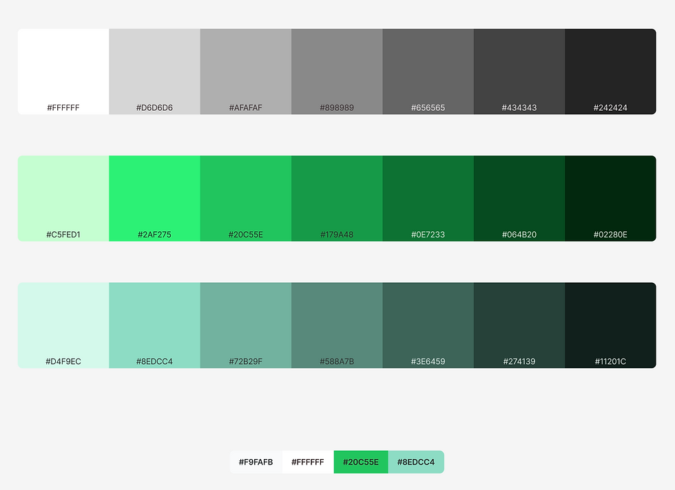
Once the flow was working I moved on to applying design elements. This stage was about bringing Nestly’s personality into the app while keeping it clear and approachable. I chose a green led palette to reflect sustainability and energy savings but also used lighter shades and whitespace to avoid overwhelming users with data.
Icons played an important role here too since they gave users quick visual references for devices and actions which reduced the need to read through everything. I also refined typography and spacing so that users could scan the app at a glance and instantly see what mattered most such as usage spikes or available rewards. This stage was about balancing a clean modern look with a design that supported decision making.

With the design in place I moved on to testing through heatmaps. This showed how users naturally interacted with the prototype and whether the design matched real behavior. The heatmaps revealed clear hotspots around rewards and progress tracking which confirmed these were strong motivators. Navigation icons also drew attention which reinforced the importance of keeping them consistent and easy to recognise.
At the same time I noticed some areas were not being used as much as expected. This gave me the chance to rethink how those elements were presented by adjusting contrast, spacing and button positioning to make them feel more inviting. By playing around with these details I guided users toward the features Nestly wanted to emphasize such as saving energy and exploring their reports while keeping the design simple and uncluttered.
5. Reflection
What I Learned
#1. Start with structure
Wireframing showed me the importance of nailing down flows and hierarchies before touching visuals. By testing early layouts I could quickly see how navigation and content placement shaped the user experience, which made the later design stages smoother and more purposeful.
#2. Design choices guide behavior
Introducing colors, icons and spacing wasn’t just about branding but about directing attention and creating clarity. I learned how subtle adjustments in visual hierarchy could encourage users to engage with specific features like rewards and reports while keeping the interface approachable.
#3. Testing reveals the unexpected
Heatmapping highlighted how users actually interacted with the app and showed me patterns I wouldn’t have predicted. It reminded me that user behavior often differs from assumptions and that iteration is key to refining both usability and engagement.
What's Next
#1. Broaden usability testing
My next step is to test with a wider group of users to validate design refinements and uncover new opportunities for improvement. Gathering more diverse feedback will ensure the app works seamlessly for different usage patterns and device habits.
#2. Expand gamification features
I plan to explore new ways to build on the rewards and progress tracking system. By deepening the gamification aspects, Nestly could encourage long term engagement and further motivate users to save energy in their everyday lives.